
If you are running a luxury photography studio but have not starting using in-person sales (IPS) you may be leaving money on the table. The investment menu is key to having a fluid sales session. But did you know the importance of where you place the collections on the menu?
Every restaurant owner knows the importance of a well thought out menu from the style down to the small details. Photographers also have a menu, whether you display it in the studio or email your clients the list of prices. Each year my studio reanalyzes how the menu for albums, collections, and wall art performed the year before in order to re-structure if needed. While we do not spend weeks on this project, it is still an important task for the growing company. Knowing which items were bought the most, which types of wall art were rarely purchased, or even which full collections were neglected is key for the company to design a better menu for the following year to suite my clients’ needs. Profitability and popularity are the two main components we look at when redesigning a menu.
The Design
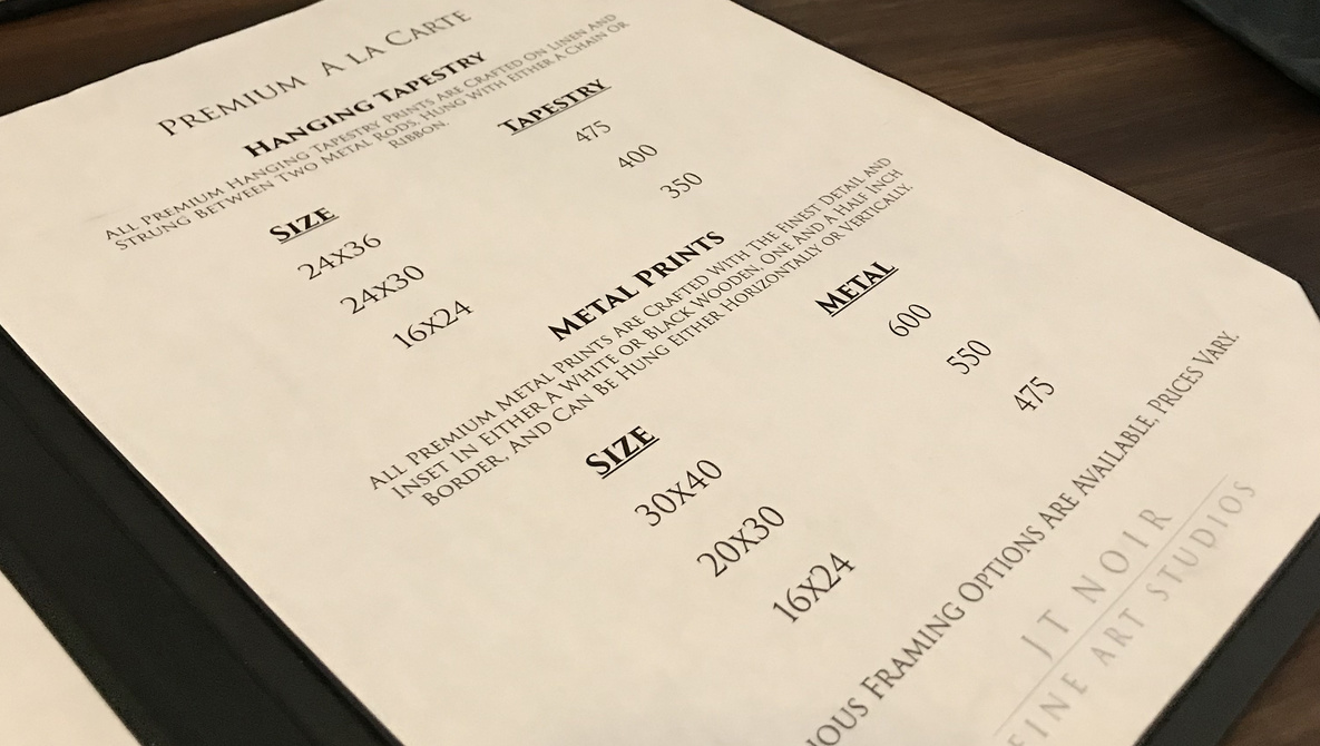
Readability will be the first item a client will notice when looking over your menu. Is the font a script that makes it hard to follow? Is it just a piece of paper? Does it have a luxury feel as if they were in a high end boutique? These design components will be the first impact they will notice when you hand them your menu. In the studio I carry four menus printed on fine art paper placed on a 8.5″ x 11″ brushed finish bi-fold. I have purchased mine through a fellow photographer Sue Bruce who buys in bulk from a restaurant menu company. Two are for boudoir and two for the underwater Aqua studio. I carry two per brand for a simple reason: I only offer certain products with the underwater to keep it exclusive.
The boudoir menus consist of one menu for the à la carte items such as wall art and standalone albums. The second is where the full collections are placed. The reasoning behind the two menus is to alleviate overload of items on one menu making the font smaller. The other is that each includes the session, makeup, one album, some digitals, and wall art depending solely on the images’ qualities. Remember we are selling the images, not the medium it was printed on. This is key to have the clients choose a collection over à la carte in that they feel the ease of not having to piece together a collection themselves, it is already done for them.
For example, the lowest collection contains a small album with nine images, the same corresponding digitals, and a credit for a wall art size of their choosing. Since the start of using these IPS menus, I have only had a small handful of clients in 12 years chose à la carte. Everyone prefers the simplicity of the collections.
Another factor are the colors. Try to keep your brand consistent for the overall experience. In the studio, the boudoir design consists of rose gold and black, whereas the Aqua portion for underwater sticks to aqua blue and white. Not only does this work for the menu, but also keeps these colors consistent when you add client gifts at the delivery of their orders.
Knowing What to Add
Knowing what items to place on your menu is all about your brand and trends. Staying ahead of the trends and never falling behind will help maintain your company as a luxury brand. Choose a few items not seen in many other surrounding companies. I chose a scroll album and tapestries from Jonathan Penney Studios for those clients who love the old world painterly feel in their portraits. The are a huge hit with the underwater clients.

The Placement
When it comes to your menu, you have a very limited amount of your client’s undivided attention. Unorganized menus will decrease the the likelihood of having the client in the right collection for them and yourself as the artist.
Whether your clients realize it or not, they are looking at the pricing menu the same way in which they would at a restaurant when ordering food. Next time you are in a restaurant take notice where you scan first. Studies have shown the first is the right side, then left, and then back to the top of the right page. By the time a person gets down to the bottom left their focus has faded. Place the lead collection where the profit is the highest on the top right page. The middle right is where is the best place for the collection that most purchase, and the bottom is the collection with the minimum where you can maintain the business expenses.
Every January we analyze last years menu and find what performed the best and the worst. We explore how it is worded and what can be changed. This year the wording on the header image will be changed. My rule of thumb is if more than five clients ask for an explanation during the previous year, we change how the text is read. Whether it is the font, the verbiage, or even the layout. Redesigns help profit margins each year simply by listening to the clients’ questions.
With the new year there will also be certain changes in what is offered. Last year the bottom right collection sold only 17% of the total sales. It will be removed and the middle collection will be moved down allowing for a collection with a larger print credit to take the top right leads place. Before this was done, I ask the VIP Facebook group to ask what they would like to see on the menu. The top need was for a collection that contained all digital images. While normally most would never want to put an all inclusive option, pricing it accordingly and at a much higher price point than all other collections was key. Before we even reprinted, the new option sold five times in two weeks just by allowing the VIP group first access to this option. 
Another thing to consider is your pricing. Going off this menu, or buying a menu option from other photographers will not benefit you if your circumstances are not exactly the same. Each area handles different price points in various ways, so make sure to put yourself in a position of pricing that benefits you and your client.
If you have anything that worked great for your IPS menu feel free to share here in the comments. Questions about it are always welcomed!