

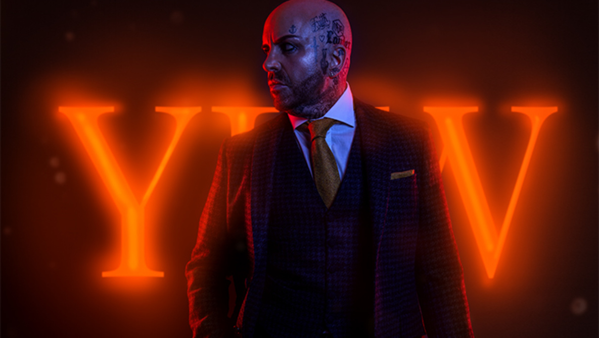
At the beginning of the year, I worked on a client job for York Fashion week with local agency NIMA and videographer Beetroot Box. The brief was to create a teaser campaign for the upcoming event.
Like every job, it had its challenges and problems to solve. The biggest challenge for the brief was creating a neon background light from scratch. If you have never tried this before, here is how I did it.

Here is the straight out of camera image. Because we pre-planned everything, we knew the model had to be lit from behind with gelled lights. Two strip lights were used with a red gel, and in front, we had a large softbox, gelled with a contrasting blue to fill the shadows. I wanted to fill the frame with as much of the model as I could and planned to extend the canvas in Photoshop.

Once the images were in Photoshop, my first move was the extension of the canvas. I did this by selecting the empty part of the background with the marquee tool, duplicating it, and then finally using free transform to stretch it out. I repeated this on the other side of the image and for all the models.

The blue in the areas lit by the fill light was not as strong as I wished. So, with a color balance adjustment layer, I added a little more blue into the fill.

Next, it was time to create the Neon sign. We had talked about finding a sign, but we wanted the neon to relate to the event. Eventually, I had the idea of using the York fashion week logo. Having used many light effects in Photoshop before, I knew I could mimic the light effect. I requested a PSD of the logo for me to use, which NIMA sent over.

Once I had the PSD, I pulled it into the image and used a layer mask to mask the file under the model. I used the pen tool to create the selection of the model. I then used FX layer styles and added an outer glow to the text. This was a good baseline for the glowing sign.

Neon signs are lit using tubes, so I knew I would need some glowing hotspots in the text to mimic the Neon look. With a brush, I painted the hard light inner hotspot lines using the color dodge blend mode. I then added some extra glow around the sign with a brush. I sampled the color of the sign and then painted around it on low opacity with a screen blend mode.

We are trying to mimic real life, and in reality, the glow of the sign would also wrap around our model. So again, I sampled the color of the text and then painted on a blank layer above the model on a linear dodge blend mode. This meant I was painting over the model on a low opacity, making it look like the light was bleeding over them.

Once the light was looking realistic enough with some small masking adjustments, I then did a little dodge and burn on the model to bring out some detail, though far less than I usually would.

Finally, to finish off the image, I added some vignette with a curves adjustment, locally painting it in to focus our eyes away from the edges and then added some high-pass sharpening.

Let me know if you have any questions in the comments!