
Architectural photography is an exacting discipline. Consequently, small mistakes can make a large impact on your body of work. In this article, I cover five common mistakes that I’ve observed in architectural photography.
I’ve never met an architectural photographer who became competent overnight. My progression evolved from 15 years of photography and then six years as a specialist architectural photographer. In the first few years of specializing, I made all of the mistakes covered in this article. They’re also common to most photographers starting to specialize in architecture. Many of them arise from moving from real estate photography (including Airbnb and hotels) into architectural photography.
In real estate photography, your objective is to get the property sold. Your end client is the property owner. In architectural photography, your objective is to highlight the design. Your end client is the architect/designer. The following mistakes are not acceptable for architectural photography.
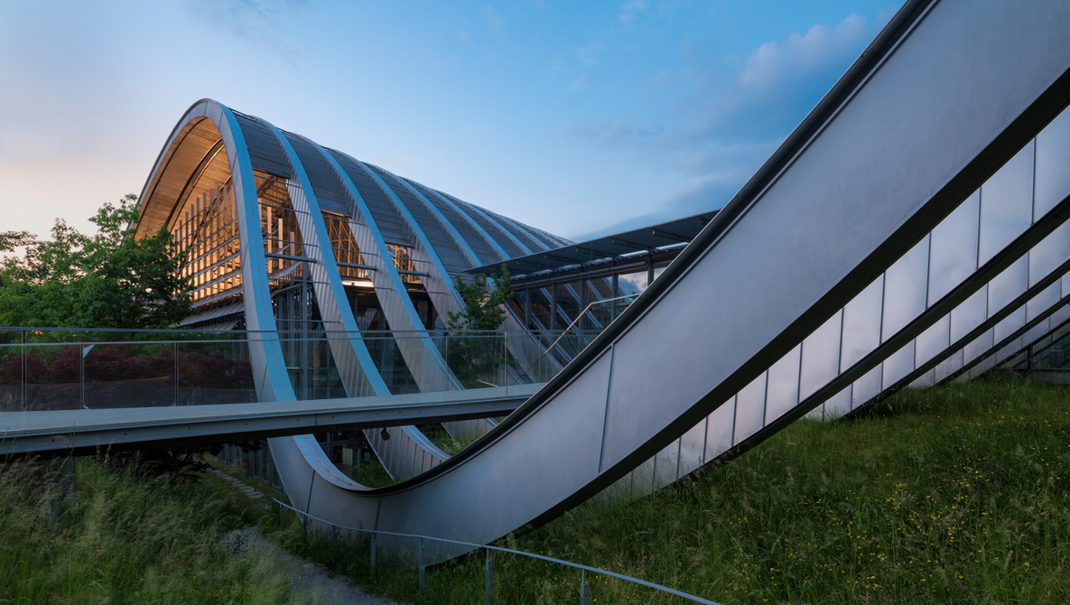
Angles That Lack Intention
Architectural photographers work predominantly with two angles: the one-point perspective (straight-on view) and the two-point perspective (corner-to-corner or diagonal view). Architectural images are effective when the intent is to show either of these angles. The mistake I often see is settling on an angle between these two — not quite straight on enough to be a one-point perspective and not diagonal enough to be a proper two-point perspective.
It is important to be deliberate when composing architectural images. Sometimes, the best composition may be the angle between the two standard angles, and if so, it’s perfectly acceptable to choose this angle. The point is, always be deliberate and intentional when choosing angles to photograph.
Blue Light Spill
Artificial light is very warm in comparison to natural light, especially during twilight or on a blue-sky day. When setting the white balance to the artificial light, blue light streams through the windows and doors of the building. If it were just the windows and doors, it would not be too detrimental to the image, but often, reflective surfaces such as the floor and furniture take on a blue color.
This is rectified in two ways. The first is to use flash and gels to balance the color temperature. For residential architecture, this technique works well, but for larger buildings, it becomes problematic trying to cover the entire scene with flash. Instead, I pick a white balance that creates natural, neutral color for the majority of the scene and then I desaturate the offending color: either blue or yellow.

Making One Image Do Too Much
A common mistake from photographers moving to architectural photography from real estate photography is trying to squeeze too much information into a single image. This often means shooting too wide. A successful architectural shoot relies on a set of images. Trying to achieve too much with a single image dilutes the quality of that image. In addition, shooting too wide introduces wide angle distortion. Subjects near to the camera are inevitably stretched.
I would hesitate to go wider than 24mm for interiors. In addition, I would aim to capture the building in 10-20 images. This will include 2-4 “hero images,” which will reveal the main design features, but I will never attempt to cover all the design features in a single image.
Moving Too Quickly
When I moved from real estate to architectural photography, I was amazed at the extra time I was given. For real estate work, I would have to cover an entire house in roughly one hour. When working for an architect, I would have the entire day. The mistake many architectural photographers make is attempting to move too quickly through the shoot.
The extra time afforded to architectural photographers means being able to work from a tripod, being meticulous about composition with micro-movements to get the perfect angles. In addition, the extra time gives you the opportunity to straighten furniture, sweep the floors, and wipe down reflective surfaces. The extra time means that much of the “retouching” should take place before the shutter is released.
Pushing Retouching Too Far
Architectural photography requires decent light and good weather. Unfortunately, the weather does not always cooperate, and the photographer has to resort to composites. In doing composites, a moody gray sky is replaced with a blue sky. The common mistake is creating a composite that is too far from the original. Even if you do a great job, the final images will feel wrong somehow. The key is to replace a moody gray sky with a slightly better sky. So instead of a perfect blue sky, choose a sky that is mostly cloudy with patches of blue.
Architectural photography also tends to use muted colors. The reason for this is that color can be a distraction. If you have too many saturated colors or areas of high contrast, it can pull the viewer away from the design elements that you’re trying to portray.
Retouching for architectural photography can take hours per image, but it should never draw attention to itself. An effectively retouched architectural image feels untouched.
Conclusion
I’ve mentioned that I’ve specialized in architectural photography for six years. I’m still new to the genre, which means that I’m constantly learning new techniques, processes, and most importantly, new ways of seeing. The five mistakes mentioned in this article I’ve observed in my own work and in the work of other photographers learning architectural photography. I’m certain that there are many more, and I would love to use the combined experience of the community to identify more common mistakes. If you can think of any, please write them down in the comments section.